
Reimagining Google Chrome through the lens of Gemini.
In this project, I explored a playful redesign of Google Chrome with Gemini at the forefront. The goal was to imagine how AI could live naturally within the browser experience—always present, yet simple and intuitive. I leaned into bold visuals and clean layouts while keeping the overall feel fun and approachable. This was more of a creative exploration than a functional prototype, but it reflects my curiosity in blending design with emerging technology.
Technology: Adobe Photoshop, Figma, Adobe XD
Services: User Interface Design
I rethought Chrome’s UI , focusing on the small things that shape everyday use—cleaner icons, refined spacing & balanced colour.

It all begins with clarity. Cleaner lines, lighter spacing, and a focus on the essentials make the browser feel less busy and more intentional.

It all begins with identity. Swapping abstract shapes for real lifestyle photos makes Chrome sign-in feel more personal and instantly recognizable.
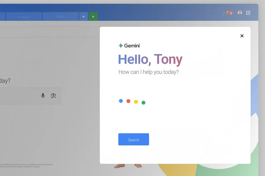
It all begins with recognition. Polished yet familiar Gemini-inspired icons keep navigation effortless while giving the interface a modern edge.

It all begins with flow. A cleaner tab structure, subtle cues, and less clutter make it easier to switch, scan, and stay organized.